Tuesday, October 11, 2011

User testing- round 2


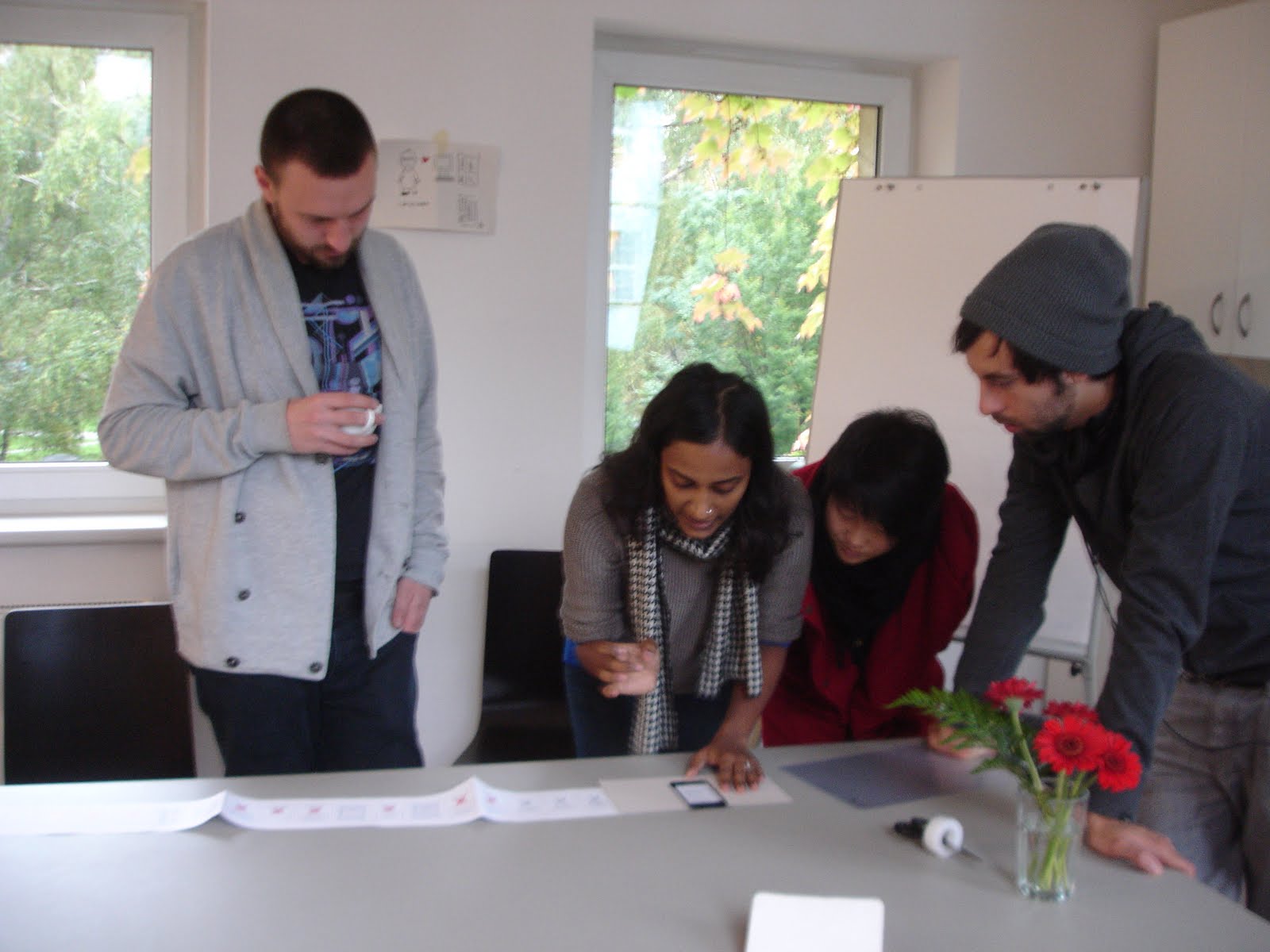
Second session of user testing!
Held at IXDS- interaction design studios.

Feedback-
  • Leaving the app in the middle of it is not advisable as it ticks off the user. Try to stick to the same UI at all points.
  • Unlocking barrier might pose a problem
  • You should have a feature to see your friends' activities
  • This would work well as a facebook app
  • Maybe the app can check your calendar and knows you are in a meeting and gives you relevant etiquette advice- just like the well mannered services
  • apps have only one shot- 2nd level doesnt work on enticing them further
  • location based- contextual notifications of etiquette
  • peer review inside the app- when you create a guideline and they check it and like it you get to know
  • my guideline notification in the start of the app or the most popular app at the start
  • embed the imposrtance of these guidelines in peoples life
  • make it easier to navigate through the guideline- guidelines by tags- when yo suddenly remember a guideline and want to find it- and maybe sms it to someone?


Feedback from Stefan -

  • Unlocking system- what is people don’t like the first 10 guidelines
  • Markers/flag for other guidelines apart from favourite ones. Ratings
  • API for website- always stay inside the app. No point if the user sees all the guidelines on the website
  • Upto 5 personal guidelines allowed
  • Everytime someone comments on your personal guideline, you should get a notification. You are the caretaker of your guideline.

Monday, October 10, 2011

User testing- round 1

Some refinements discussion with Julia first:
  • Warn- first about 5 left, then later always when 1 left
  • pop up your personal guideline in the beginning
  • flip button for your personal guideline and when you receive it from someone
  • all your favourites become your profile page- and from there you can select a personal guideline. and everytime you like something, it asks if you want to make it your personal guideline?or maybe asks just once and then you can change it from profile page. on the profile page - you view a collection of your favourites with an arrow button which you swipe.
  • profile page should appear only when you have liked something- appears with a notification
  • just like near the app icon- there are number notifications- instead it could be the number of the current guideline? ask paul
  • question mark button on how exactly to create a guideline- take rules from the website
  • black screen behind/shade during notification
  • guideline waves its hands after being unlocked
  • grey bump button until personal guideline is acquired.


Well the most important stage! Seeing what others think of the app- especially those who havent been deep diving into the app making for the last two months! Its always great to get some perspective and the round 1 of user testing was extremely helpful

I used some "app protoyping tools" and created some as you can see.
So we(Julia and I) explained the basic functioning and concept behind the app to our users and had a run through the different stages. At each stage posing a question to them and asking them if they understand the navigation and how we can make it better and whether they would like some more feedback from the app at any point. And ofcourse, if the app were such, would they install it?

Questions for user testing:

Start:

  • In the beginning- zoom and pan and select- is it clear to click the figures?
  • After receiving how many guidelines should the user be asked to share?
  • When does the warning of ‘x guidelines left to be unlocked’ appear? Every time there are 5 left? Or just once in the beginning after 5 are left, and afterwards, every time 1 is left.
  • Do we need a home button at all times/stages?

Unlocking:

  • Do we need the text unlocking? Or is the sound feedback and text-sorry, congrats enough?
  • Should the final guideline do a jig, or happy face, or surprise the user on finally receiving it?

Profile page:

  • If the user tries to access profile page before a personal guideline is acquired, does it ask it to select a personal guideline or is profile page not available?

Personal guideline:

  • One personal guideline that the user chooses or all his favourites become his personal guidelines?
  • If one personal guideline – then does the user enter name behind?
  • Font might change- is that okay?
  • Keyboard appears – clash with eetiquette style?
  • Earn a personal guideline change later in the game?

Flip:

  • Can the user always flip guidelines to see the name?
  • Can the user see names behind the ones he shared with bump? If yes, where does the flip sign occur?
  • Should it also flip the speech bubble?
  • Is it consistent that not all guidelines can flip to reveal a person they belong to? Or maybe that happens at a later stage?

Icons and notification:

  • Should all the icons and notifications which are to be clicked have a shadow? Even the cross stitch grid in the beginning?
  • Does the background become darker or fade out when a notification panel appears?

Like:

  • Maybe when you like something, the user has the option of making it a personal guideline?
  • Or do all favourites become personal guidelines? Also a good way of viewing favourites together.
  • Is the position of the heart fine and noticeable even from the grid view?

Bump:

  • If the user tries to share by bump before a personal guideline is acquired, does it ask it to select a personal guideline or is the bump function not available?

Posting:

  • Does the user need a custom text message with the posting? Or should there be a standard eetiquette note?
  • Does the email and facebook functions require a different type? Like verdana/Georgia?

Counter:

  • A speech bubble from the counter- is this clear? The counter will have to figure out how many unlocking chances are left if the user is simultaneously unlocking and sharing. Even though there will be 3 new chances earned by the user, the user can still unlock 7 because of the beginning 10 which he hasn’t exhausted as yet. Is this confusing?

Create guideline:

  • Font might change- is that okay?
  • Keyboard appears - clash with eetiquette style?
  • Is it odd to have 49 guidelines that you can create?
  • Should these guidelines be different in the home page- what if user clicks on it before unlocking any other guideline? Should there be a notification in the beginning saying select 1-101. But what happens if you click on the 103? Can the user still create a guideline without seeing the others?

History page:

  • Does the user need this page?


And the results and feedback:

  • In the beginning, when you click on the first notification, it should zoom right away a little(just to demonstrate) and then you zoom in by hand
  • The main buttons on the home page should be bigger and further away from the edge, which a bigger sensitive area to touch. maybe the flowers can be clicked too.
  • People who do not want to click on buttons too much- may not need the "congratulations button" and it directs them straight to the guideline page and before the guideline is typed out it says congratulations!
  • Sound, colour and text change as feedback
  • The warning turns people off- show in a positive and motivating way
  • Farmville example- everyday get the chance to unlock a guideline- if you fail and you want that guideline, you need to share.
  • Bingo- you get an incentive when you have completed a row- 5 more chances to unlock!
  • Limit the unlocking to time/days- time limitations
  • Person should have the option to choose a guideline, and whether he/she wants to choose at all
  • I want a unique guideline- create my own guideline
  • Favourite guideline should be chosen out of the liked ones
  • Jumping out of the app- too cumbersome. jumping to website- website too large, always have to zoom in. what if we create an extra hidden page on website meant for this app?
  • Own guideline should only be submitted - no sharing liking, commenting. view your own submissions from your profile page.
  • A submitted guideline to be approved, returns to user in the grid when its approved - user is the first to know if its approved- announcement made. the incentive to create new guideline is that you receive 5 new vouchers!
  • History page is more important to us than the user- analytics for us.
  • When the guideline unlocks- some animation, hands waving, 360 degree flip. if unanswered incorrectly, it turns doen hands, sad face.
  • Sharing issue-i would not always share. work arounds- send emails to yourself.
  • Mms, sms sharing option- other target groups after from just social networks.
  • Print out version- eE post cards!
  • English/german version?
  • What does the start page plus logo look like- start page could have your personal guideline on it to remind you of it.
  • If two people bump and I already have received your guideline before, then it stays like that or tells me I already have this guideline. Otherwise the problem of two names behind each card- and this could pose a problem in the long run!

Saturday, October 8, 2011

Graphic Design feedback

  • Step back 2-3 px away from boundary
  • Try to work with a shadow under the notification boxes
  • Text should be blue or magenta and no other colour
  • The keys are nice but I am mixed up with two different semantic layers. Looking at the keys I search for the picture-puzzle. But in fact it is only a multiple choice. The keys don't work. Just stick with the text.
  • The thin line does not accord to the rest of the design. without would also be fine.
  • Think about the different information-layers and distinguish them mor obvious. I would in general distinguish more over colours, than over the kind of writing (capital letters/mixed). Shadows under the bubbles also help to distinguish layers
  • If the thin outlines and the sticthed lines bump together it won't work. Maybe the inactive 'stitches' consist more of a coloured field (30% of the blue p.ex) than of an outlined figure.
  • The Text of the message should perhaps be in a more rtf-Style, somewhat like Verdana or Georgia, and can be black.
  • This looks a bit strange. Also problematic in outzooming. Maybe you invent a plain, not stitched heart, which lays under the number? This is also more where the heart is.
  • Create guideline feature- maybe you type in one font and it saves the guideline in tant gertrud font
  • Keep a number for counter instead of visual stitches. Put this counter where the"back" button earlier was located- bottom left corner.
  • Keep the history page button on the left bottom along with the other icons. left signifies back.
  • Make the text under the icons permanent
  • Make the notification boxes with slanted corners. And make separate boxes underneath for okay, cancel, view, and other options which are clickable. always make the notifications clickable.
  • When moving from the question- to unlocking- to congratulations- the surprise element of having received the guideline could be that the little cross stitch does an animation- shakes and surprises or makes a happy face?
  • Make the shadow less- 50 percent.

Finding crucial points and questions for User testing

And the pictures of the board as usual!


First set of Questions for the discussion:

Icons:

  • Can two text of the function icons appear together?
  • First tap- only text shows, second tap-highlights and goes to the next page?
  • It animated in the beginning while loading the page and shows what each icon does?

Bump:

  • What does the text say?
  • Do you have to keep the app on for this function?
  • Click here and then bump?

Other:

  • Text on home page - Zoom in to see the guideline number? Emphasis on zoom?
  • All guidelines don’t fit inside the box
  • What about the tags? Should they appear after flipping the card?
  • Distance from boundary?
  • Organizing HOME, ABOUT, BACK PROFILE in a uniform way
  • What should the profile page be called? And history page?
  • Outlines or 30% blue fo inactive stitches?
  • What happens to flip action when you receive a free guideline from eE
  • Giving encouraging tips like No. 13 has already collected 20 guidelines. What about you?- Is this possible?
  • Starting point-After receiving 10 guidelines, user doesn’t know wht to do. Website function still available?
  • Bonus round: post no. 10 on facebook to receive guideline no. 100!
  • Home page still highlighted if you navigate from there and back-back-back leads you to home page? Figure out highlights during navigation

Feedback and interaction generation with Paul

  • Three buttons in the corners- home, about, profile. Home button turns into back button. This is similar to ios back button and therefore easier to relate to
  • Counter on top- when you receive a new guideline. But its not a guideline you receive, but another chance to unlock a guideline- this lets you decide which guideline you want to pick
  • Bump: you need to click on bump to activate it, but not sure yet if the receiver needs to click on receiving mode as well?
  • Smaller figure and bigger speech bubble- to fit the guideline as well as tags- and yet have them of a reasonable font size
  • Comment icon- no website icon for it. The share icon goes better for the comment icon. Think of a new share icon.
  • Unlocking sound feature as a audio feedback.
  • The question page- change the hierarchy of text as its not clear what one should read
  • Navigation from the grid of stitches- when you click on one. The rest of the stitches fade out and this particular stitches enlarges/ diminishes? to a standard size(if not already at that size) and aligns to the bottom center and the question appears on top in a bubble. Can you see the heads of the stitches at the very beginning or do they appear after a certain point of zooming in- paul needs to get back with this.
  • Instruction notification when you start the app- should mention the word zoom and pan to view the guidelines.
  • In the beginning, the user explores and discovers and answers and collects 5 guidelines. Then a notification appears about how he has only 10 more to go. And after that he must share in order to view more guidelines. So that the user is not stumped and angry at the end, thinking he was fooled by eetiquette. A soft warning helps. Also, while answering the question, he can have as many tries –to make it as easy and accessible in the beginning- so they do not lose a chance if they make a mistake. Find out from user testing how many to start with in the beginning
  • After this the user gets to choose and make one of them his personal guideline. Or do all you favourites becomes your personal guidelines? Maybe its a sign up process. Personal guideline is important as its you identity. when you post on someone else's wall it will say that guideline no. 23 has posted this on your wall. Earn a personal guideline change later in the game?
  • Every sharing action= receiving 1 chance to unlock a new guideline.
  • Font issue- as tant Gertrud might not be able to be embedded in the app- the guidelines might need to be images. This is possible except for the create guidelines feature- should we incorporate a font change there? Like Helvetica? No tags on the create guidelines page. Prevents tag spamming. When you submit- a white screen appears asking is this the text you want to submit, enter name and email id. When you save, the guideline turns to pink and becomes a guideline.
  • Do we need the history page? Is it important for the user to know?
  • The share functions and comment function- navigation involves a white screen coming up and overlaying the original background- and a cross stitch box inside which everything happens? Email, facebook, twitter, bump, website? Otherwise no box and it will be like entering other screens – but the overlay vanishes and jumps back to original screen if you press close. comment function happens directly on the website as the website is mobile optimized. Paul needs to get back to me about all these functions and how they can be programmed and accordingly a uniform structure needs to be designed. Also the keyboard appears while typing in these functions and that should not clash with the eetiquette style.
  • The text for the share, comment, like buttons are permanently there.
  • Warning on facebook- post on friend’s wall- blaming tone or positive posting tone? Should it be a custom text you can add with it or a standar eetiquette note.
  • Image appears on facebook, or just a link to the website with a small thumbnail- paul needs to get back to me about the possibilities of posting.
  • Encouraging tips possible but keep it for the 2nd level as this would need building an entire server which would communicate with your friends’ phones.
  • No share and warn distinction- the warn function is just for facebook- so the text reads post on your wall or post on friends wall
  • When the counter appears- a speech bubble coming out of it with the notification that this is a counter
  • The history page cannot tell you names of people you sent it to as an iphone does no allow information from email contacts to be transferred


Wednesday, September 28, 2011

Level 1

This is how the boards looked before the developers came and soon we started shifting around the images to create and package new interactions that made sense.


After the talk with the developers, we figured we could divide the app into two parts. Level 1 gives a brief introduction and preview of what the app is about, where the user engages in discovering and sharing new guidelines. Level 2 gets a little more complex, with a location based service of finding people and finding guidelines.
This also helps in the problem being caused by asking the users to sign up at an early stage without getting to even know the app. Sign up also require personal data to be received by us and tracking each person and their activities.

The following is more or less what Level 1 is about:


Home page, 150 guidelines-

Notification: unlock your personal guideline by answering correctly.

If you answer incorrectly-
You can’t enter that guideline again

If you answer correctly –
Notification: Congratulations! You have also received 10 free guidelines but you must unlock them first. You have only 10 chances. Think before answering, with 3 consecutive mistakes, you lose out on 1 guideline.

Two options- view guideline, collect more
1. View guideline-
You receive the guideline card(page with cross stitch figure, speech bubble with the guideline, three functions below-like, website, share)
Flip the card and it says YOU (enter your name?)
Back to home page- Notification again - You have received 10 free guidelines but you must unlock them first. You have only 10 chances. Think before answering, with 3 consecutive mistakes, you lose out on 1 guideline.

2. Collect more
Click on guidelines and answer questions to unlock other guidelines.
The collected guidelines change colour to pink after being answered correctly and guideline cards appear with their functions

After you are done with the 10 free vouchers, it does not show any questions answers- if you click on empty guidelines- it goes to the empty guideline card with unclickable functions- (is the website one still unclickable?)

Notification: To view and collect more guidelines, you must share the ones you already have. (does this appear on home page or guideline card page)
Every 3 times you post different guidelines on facebook (on your wall)/email to a friend, you will receive a guideline.

Every time you send a warning, you will receive a guideline. Be careful not to overdo sending warnings- you cannot send warnings more than thrice a day.(Notification appears telling you so if you try to)

Guideline card page-

Share-
1. Facebook- share/warning
Number 55 has shared guideline number 74 (posts on your wall)
Number 55 thinks you have not been following appropriate e-etiquette and has sent you a Number 74 warning!(post on friend’s wall)

2. Email-share/warning

3. Bump your phones to collect the other’s personal guideline

Create guideline-

Enter a guideline card from 102-150 and write in the same typeface
Two options - Save, submit, (share?)
1. Save-
Stores in your grid of guidelines- changes to pink and becomes a real guideline

2. Submit-
Notification: Thank you for submitting. Your guideline has not been submitted on the website. Click on website icon to view other suggested guidelines and vote for the best!

Click on website – direct link to website- suggested guideline list

Like the guideline-

Click on like button- heart appears on face

You can view favourites together while scrolling, swiping through grid.

(Does this get submitted to the eE?)

Tuesday, September 27, 2011

Meeting with developers

Sign up

• Get a starter pack of free guidelines when signing up

• Sign in process necessary? What stage?

• Storing data- login credentials. If you forget password- fall back- the whole process is a hue package

• Option to be visible or not- status notification


Game

• 101 vs 150 guidelines

• What’s the starting home page in which page?all same?

• Suggested guidelines-new created ones should go up on the website-up for voting.

• After submitting new guidelines- notification thankyou for submitting, your guidline is up on the website

• German / English

• What is different and important about your personal guideline-your personal information or identity becomes the guideline

• Level 1: Discover and sharing , Level 2: sign up location activity

• App updates- with new suggested guidelines incorporated in ee style

• A score or history of what has happened so far

• About page- talk about level 1 and coming soon level 2

• Explanation at each stage is important

• Visuals to indicate how man vouchers you have received, how many left


Sharing

• eE App- different channnels- facebook, email-eE App

• Direct digital sharing via eE App?

• Start sharing via fb, email and direct bump only

• Promotional aspect- it should not restrict sending etiquette warning through internal messaging then only people with the apps can receive it.

• Facebook-
o 1 post on your wall
o 2 send a message to someone
o 3 post on someone else’s wall
o 4 fb as a platform for viewing what others have collected or unlocked

• Twitter, google plus, foursquare(difficult)?

• Anonymous sharing will be misused

• You need to share to get more guidelines


Incentive

• Get points when sh
• aring guidelines-incentive

• 10 vouchers- answer 10 questions relating to 10 guidelines correctly and receive them. If you answer thrice incorrectly, you lose one voucher

• If guidelines are given as reward/bonus at random then must select the most popular guidelines to give an incentive to share

• Look for a distinct selection of a guideline- eg. post 10 guidelines on fb to receive guideline number 100


Map

• Map also shows guideline interactions between people- white x for interactions, pink x for people. Shows the context, places, hot spots where guidelines were exchanged and doesn’t involve tracking a person(privacy affected)

• Only see adopted guidelines on map?

• Approximate location of people logged in

• Show my X differently

• Location – server which collects data exchange between devices-time consuming

Thursday, September 22, 2011

Doubts

- changing landscape to portrait-all pages layouts
- change the name of home to something more holistic-game, play
- maybe the four corner categories should include a category for directly visiting your own personal guideline card
- should it start with a handful of guidelines already open to make the user want to collect more and give an idea of what its all about
- making the cross stitch figures come alive especially when the guideline in concern is discussed a lot or plays an important role- to bookmark
- what could be bonus rewards?
- what is the end reward of the competition
- notification pages- the background becomes grey or less opacity?
- drop shadows/inner glows? or very simple language?
- even if the user doesn't play the game and go collecting guidelines, can he still access all the guidelines by going to the website icon?
- is there a notification if someone posts a guideline or your personal guideline on facebook twitter?
- what can be a reaction of the app to a nice interaction or gesture by the user to reward him?
- writing text for the about page as well as generating content for the questions relating to each guideline

Service Journey- defining interactions


Wednesday, September 21, 2011

Testing on the Iphone

Testing the size of fonts and cross stitches to see which ones work and are recognisable from a standard distance.

The two cross stitch font that I'm using - Tant Gertrud - is not very legible at smaller font sizes and when used as body text, it's readability reduces. Thus, we have incorporated another font -Klavika for these two purposes.

For making the cross stitch icons, I have to follow a particular grid, similar to the real cross stitching process. The smaller the cross stitches, the more accurate and defined the form looks. But after testing on the iphone I saw that at first glance you don't realise they are made out of cross stitches, only when you zoom in do you see. But for this app, we want the entire look and feel of these stitches and thus I had to settle on one size of the cross stitches as the least I could reduce it to while building icons.

There is a scaling problem with these cross stitch icons as the same icon if scaled up will not look as good and refined as another one made out of smaller sized cross stitches but as big as the scaled up icon.


Monday, September 19, 2011

Review with Katrin

test the font on the iphone
give a digital look and feel even to the stitches
getting simple with shapes and colour
scaling problem with the cross stitches
white background or grid- analogue to website
klavika type
on/off of elements rather than new elements
xxx grid link to map- same zooming in and out structure
screensaver?
link to content
user perspective vs eE perspective
specify target group
connecting people with guidelines
moving cross figures- for most alive and discussed guideline- link to content
defined form for the guidelines
where/how do the guidelines always appear? where do the functions always appear- keep the interaction simple and similar

Thursday, September 15, 2011

Service Journey

Insights from a previous project at Creation Center called Community 3.0

Become Aware and Discover

Success Factors:
Having an engaged community promoting via word of mouth(analog and digital)
Winning opinion leaders/testemonials/blogosphere
Rating/ Positioning in App store/Marketplace
Invitation Schemes
Marketing cooperation with Mobile Operators/Known Brands
Search Engine Optimization


Access and Join
Key challenges:
Make signing up experience simple and fun/playful
I possible avoid signing up at all
'Auto fill in tools' transparency
Share user data with other services
Alternative ID processes via voice recognition/Sim
Provide data care, meeting legal issues

Success Factors:
Placing signing up as late in the process as possible
Profile transfer from other services eg Fb, my space
Profile input: start small, grow later


Try and Explore
Key challenges:
Critical moment:1st sight counts

Success factors:
Try and explore without signing up
Keep start as simple and fun as possible
Direct social link create stickiness, eg your friends welcome you on an application
Free content/teaser/trial budget


Create and Consume
Key challenges:
Experience clear and unique application characteristics

Success factors:
Customizing opportunity
Permanent feedback channel
Local exclusive events/offline activities to strengthen communities - real&virtual interaction/take the application experience to the real world
Environment should encourage honesty for future accountability


Manage and Organise
Key challenges:
People are like messies, at the beginning they gather everything
Limitation of amount of friends/content as management support

Success factors:
Ideally no direct management within applications needed
Sub organisation eg. sticker album(aka aki)
Different structures for different user behavior
User generated structures eg. personal city guides from community members are accssible for all
Profile indication management
One access to various social networks, one source for many


Share and Exchange

Success factors:
Social bookmarking
User rating and recommendation
Community moderation
Aggregation
Hyper targeting/Multiple profiles
Targeted ads
Cross app advertising


Retain and Revive
Success factors:
Involvement of community in future service development
Images are the key, too much text is no fun
Competition/scoring/gaming
Bonus System
Integrate user feedback and take it seriously, handle it sensibly
Create sub groups
Local Newsletters
The more personal content, the better
Entertainment/Fun

Review with Julia

So after the review the Julia we have now finalised on the features and changed/moved around how and in what order they appear to the user. We want to keep it as simple and comprehensive and yet incorporate all the features.

And we're mostly doing BOTH the apps!


On the board!

Seeing the app interactions on the board to understand them better. Inputs from Julia on the pink post its- what works, what doesn't, and what could change.

The pink post its for the eE share app-
What is Sign up process?
What is the service journey?
Commercial aspect?
See Bump App.
Create your own guideline as a feature.
Flight seat booking process for choosing guideline?
Can person choose their own guideline?
Start at Local aspect of the map- then zoom out to the world map.
Keep the same channels for communication through the app- just like the eE guidelines suggest.
Search function for searching the number of guidelines.
Keep icons simple.
Nice voice recording feature, but maybe too advanced?
Commenting feature-link to website.

The pink post its for the Tetris app-
Cloth texture full page?
What is the meaning of the two colours
What is the sign up process - enter name? profile?
What happens in the corners of the screen
Combination of style elements?


Trying out icons eEtiquette style

Wednesday, September 14, 2011

Review with Anders

You should try to create an analog way of testing this, without the app.

Create different elements in paper, and create instructions for the game play. By making it on paper, you can figure how it could behave, grab elements and move them around. So any element that you have on the screen you make a paper square, or rectangle, buttons, images etc. Then you rearrange them to show how each interaction occurs.

The visual language looks good, but you know you need to test these interactions. One way is to create a keynot presentation talk them through using it. Design every state in the app. keynote is good because you can put it on to an ipad.

The second way to create a paper prototype that allows you to do the same thing.

Have a look at Sketching the User experience again. The problem with making screens on the computer is that you cant manipulate them, as easily.

You just have to try out as many different animations as possible to see which you like. When in doubt sketch.