Tuesday, October 11, 2011

User testing- round 2


Second session of user testing!
Held at IXDS- interaction design studios.

Feedback-
  • Leaving the app in the middle of it is not advisable as it ticks off the user. Try to stick to the same UI at all points.
  • Unlocking barrier might pose a problem
  • You should have a feature to see your friends' activities
  • This would work well as a facebook app
  • Maybe the app can check your calendar and knows you are in a meeting and gives you relevant etiquette advice- just like the well mannered services
  • apps have only one shot- 2nd level doesnt work on enticing them further
  • location based- contextual notifications of etiquette
  • peer review inside the app- when you create a guideline and they check it and like it you get to know
  • my guideline notification in the start of the app or the most popular app at the start
  • embed the imposrtance of these guidelines in peoples life
  • make it easier to navigate through the guideline- guidelines by tags- when yo suddenly remember a guideline and want to find it- and maybe sms it to someone?


Feedback from Stefan -

  • Unlocking system- what is people don’t like the first 10 guidelines
  • Markers/flag for other guidelines apart from favourite ones. Ratings
  • API for website- always stay inside the app. No point if the user sees all the guidelines on the website
  • Upto 5 personal guidelines allowed
  • Everytime someone comments on your personal guideline, you should get a notification. You are the caretaker of your guideline.

Monday, October 10, 2011

User testing- round 1

Some refinements discussion with Julia first:
  • Warn- first about 5 left, then later always when 1 left
  • pop up your personal guideline in the beginning
  • flip button for your personal guideline and when you receive it from someone
  • all your favourites become your profile page- and from there you can select a personal guideline. and everytime you like something, it asks if you want to make it your personal guideline?or maybe asks just once and then you can change it from profile page. on the profile page - you view a collection of your favourites with an arrow button which you swipe.
  • profile page should appear only when you have liked something- appears with a notification
  • just like near the app icon- there are number notifications- instead it could be the number of the current guideline? ask paul
  • question mark button on how exactly to create a guideline- take rules from the website
  • black screen behind/shade during notification
  • guideline waves its hands after being unlocked
  • grey bump button until personal guideline is acquired.


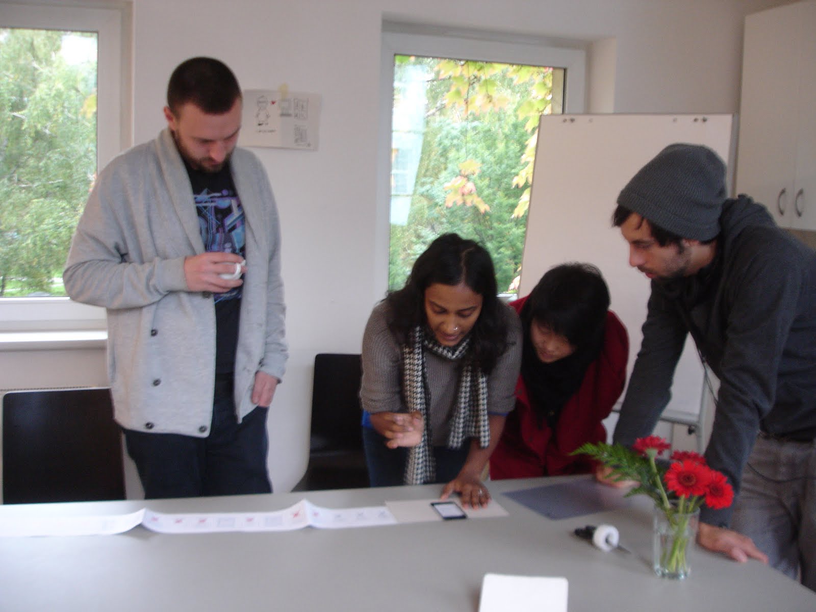
Well the most important stage! Seeing what others think of the app- especially those who havent been deep diving into the app making for the last two months! Its always great to get some perspective and the round 1 of user testing was extremely helpful

I used some "app protoyping tools" and created some as you can see.
So we(Julia and I) explained the basic functioning and concept behind the app to our users and had a run through the different stages. At each stage posing a question to them and asking them if they understand the navigation and how we can make it better and whether they would like some more feedback from the app at any point. And ofcourse, if the app were such, would they install it?

Questions for user testing:

Start:

  • In the beginning- zoom and pan and select- is it clear to click the figures?
  • After receiving how many guidelines should the user be asked to share?
  • When does the warning of ‘x guidelines left to be unlocked’ appear? Every time there are 5 left? Or just once in the beginning after 5 are left, and afterwards, every time 1 is left.
  • Do we need a home button at all times/stages?

Unlocking:

  • Do we need the text unlocking? Or is the sound feedback and text-sorry, congrats enough?
  • Should the final guideline do a jig, or happy face, or surprise the user on finally receiving it?

Profile page:

  • If the user tries to access profile page before a personal guideline is acquired, does it ask it to select a personal guideline or is profile page not available?

Personal guideline:

  • One personal guideline that the user chooses or all his favourites become his personal guidelines?
  • If one personal guideline – then does the user enter name behind?
  • Font might change- is that okay?
  • Keyboard appears – clash with eetiquette style?
  • Earn a personal guideline change later in the game?

Flip:

  • Can the user always flip guidelines to see the name?
  • Can the user see names behind the ones he shared with bump? If yes, where does the flip sign occur?
  • Should it also flip the speech bubble?
  • Is it consistent that not all guidelines can flip to reveal a person they belong to? Or maybe that happens at a later stage?

Icons and notification:

  • Should all the icons and notifications which are to be clicked have a shadow? Even the cross stitch grid in the beginning?
  • Does the background become darker or fade out when a notification panel appears?

Like:

  • Maybe when you like something, the user has the option of making it a personal guideline?
  • Or do all favourites become personal guidelines? Also a good way of viewing favourites together.
  • Is the position of the heart fine and noticeable even from the grid view?

Bump:

  • If the user tries to share by bump before a personal guideline is acquired, does it ask it to select a personal guideline or is the bump function not available?

Posting:

  • Does the user need a custom text message with the posting? Or should there be a standard eetiquette note?
  • Does the email and facebook functions require a different type? Like verdana/Georgia?

Counter:

  • A speech bubble from the counter- is this clear? The counter will have to figure out how many unlocking chances are left if the user is simultaneously unlocking and sharing. Even though there will be 3 new chances earned by the user, the user can still unlock 7 because of the beginning 10 which he hasn’t exhausted as yet. Is this confusing?

Create guideline:

  • Font might change- is that okay?
  • Keyboard appears - clash with eetiquette style?
  • Is it odd to have 49 guidelines that you can create?
  • Should these guidelines be different in the home page- what if user clicks on it before unlocking any other guideline? Should there be a notification in the beginning saying select 1-101. But what happens if you click on the 103? Can the user still create a guideline without seeing the others?

History page:

  • Does the user need this page?


And the results and feedback:

  • In the beginning, when you click on the first notification, it should zoom right away a little(just to demonstrate) and then you zoom in by hand
  • The main buttons on the home page should be bigger and further away from the edge, which a bigger sensitive area to touch. maybe the flowers can be clicked too.
  • People who do not want to click on buttons too much- may not need the "congratulations button" and it directs them straight to the guideline page and before the guideline is typed out it says congratulations!
  • Sound, colour and text change as feedback
  • The warning turns people off- show in a positive and motivating way
  • Farmville example- everyday get the chance to unlock a guideline- if you fail and you want that guideline, you need to share.
  • Bingo- you get an incentive when you have completed a row- 5 more chances to unlock!
  • Limit the unlocking to time/days- time limitations
  • Person should have the option to choose a guideline, and whether he/she wants to choose at all
  • I want a unique guideline- create my own guideline
  • Favourite guideline should be chosen out of the liked ones
  • Jumping out of the app- too cumbersome. jumping to website- website too large, always have to zoom in. what if we create an extra hidden page on website meant for this app?
  • Own guideline should only be submitted - no sharing liking, commenting. view your own submissions from your profile page.
  • A submitted guideline to be approved, returns to user in the grid when its approved - user is the first to know if its approved- announcement made. the incentive to create new guideline is that you receive 5 new vouchers!
  • History page is more important to us than the user- analytics for us.
  • When the guideline unlocks- some animation, hands waving, 360 degree flip. if unanswered incorrectly, it turns doen hands, sad face.
  • Sharing issue-i would not always share. work arounds- send emails to yourself.
  • Mms, sms sharing option- other target groups after from just social networks.
  • Print out version- eE post cards!
  • English/german version?
  • What does the start page plus logo look like- start page could have your personal guideline on it to remind you of it.
  • If two people bump and I already have received your guideline before, then it stays like that or tells me I already have this guideline. Otherwise the problem of two names behind each card- and this could pose a problem in the long run!

Saturday, October 8, 2011

Graphic Design feedback

  • Step back 2-3 px away from boundary
  • Try to work with a shadow under the notification boxes
  • Text should be blue or magenta and no other colour
  • The keys are nice but I am mixed up with two different semantic layers. Looking at the keys I search for the picture-puzzle. But in fact it is only a multiple choice. The keys don't work. Just stick with the text.
  • The thin line does not accord to the rest of the design. without would also be fine.
  • Think about the different information-layers and distinguish them mor obvious. I would in general distinguish more over colours, than over the kind of writing (capital letters/mixed). Shadows under the bubbles also help to distinguish layers
  • If the thin outlines and the sticthed lines bump together it won't work. Maybe the inactive 'stitches' consist more of a coloured field (30% of the blue p.ex) than of an outlined figure.
  • The Text of the message should perhaps be in a more rtf-Style, somewhat like Verdana or Georgia, and can be black.
  • This looks a bit strange. Also problematic in outzooming. Maybe you invent a plain, not stitched heart, which lays under the number? This is also more where the heart is.
  • Create guideline feature- maybe you type in one font and it saves the guideline in tant gertrud font
  • Keep a number for counter instead of visual stitches. Put this counter where the"back" button earlier was located- bottom left corner.
  • Keep the history page button on the left bottom along with the other icons. left signifies back.
  • Make the text under the icons permanent
  • Make the notification boxes with slanted corners. And make separate boxes underneath for okay, cancel, view, and other options which are clickable. always make the notifications clickable.
  • When moving from the question- to unlocking- to congratulations- the surprise element of having received the guideline could be that the little cross stitch does an animation- shakes and surprises or makes a happy face?
  • Make the shadow less- 50 percent.

Finding crucial points and questions for User testing

And the pictures of the board as usual!


First set of Questions for the discussion:

Icons:

  • Can two text of the function icons appear together?
  • First tap- only text shows, second tap-highlights and goes to the next page?
  • It animated in the beginning while loading the page and shows what each icon does?

Bump:

  • What does the text say?
  • Do you have to keep the app on for this function?
  • Click here and then bump?

Other:

  • Text on home page - Zoom in to see the guideline number? Emphasis on zoom?
  • All guidelines don’t fit inside the box
  • What about the tags? Should they appear after flipping the card?
  • Distance from boundary?
  • Organizing HOME, ABOUT, BACK PROFILE in a uniform way
  • What should the profile page be called? And history page?
  • Outlines or 30% blue fo inactive stitches?
  • What happens to flip action when you receive a free guideline from eE
  • Giving encouraging tips like No. 13 has already collected 20 guidelines. What about you?- Is this possible?
  • Starting point-After receiving 10 guidelines, user doesn’t know wht to do. Website function still available?
  • Bonus round: post no. 10 on facebook to receive guideline no. 100!
  • Home page still highlighted if you navigate from there and back-back-back leads you to home page? Figure out highlights during navigation

Feedback and interaction generation with Paul

  • Three buttons in the corners- home, about, profile. Home button turns into back button. This is similar to ios back button and therefore easier to relate to
  • Counter on top- when you receive a new guideline. But its not a guideline you receive, but another chance to unlock a guideline- this lets you decide which guideline you want to pick
  • Bump: you need to click on bump to activate it, but not sure yet if the receiver needs to click on receiving mode as well?
  • Smaller figure and bigger speech bubble- to fit the guideline as well as tags- and yet have them of a reasonable font size
  • Comment icon- no website icon for it. The share icon goes better for the comment icon. Think of a new share icon.
  • Unlocking sound feature as a audio feedback.
  • The question page- change the hierarchy of text as its not clear what one should read
  • Navigation from the grid of stitches- when you click on one. The rest of the stitches fade out and this particular stitches enlarges/ diminishes? to a standard size(if not already at that size) and aligns to the bottom center and the question appears on top in a bubble. Can you see the heads of the stitches at the very beginning or do they appear after a certain point of zooming in- paul needs to get back with this.
  • Instruction notification when you start the app- should mention the word zoom and pan to view the guidelines.
  • In the beginning, the user explores and discovers and answers and collects 5 guidelines. Then a notification appears about how he has only 10 more to go. And after that he must share in order to view more guidelines. So that the user is not stumped and angry at the end, thinking he was fooled by eetiquette. A soft warning helps. Also, while answering the question, he can have as many tries –to make it as easy and accessible in the beginning- so they do not lose a chance if they make a mistake. Find out from user testing how many to start with in the beginning
  • After this the user gets to choose and make one of them his personal guideline. Or do all you favourites becomes your personal guidelines? Maybe its a sign up process. Personal guideline is important as its you identity. when you post on someone else's wall it will say that guideline no. 23 has posted this on your wall. Earn a personal guideline change later in the game?
  • Every sharing action= receiving 1 chance to unlock a new guideline.
  • Font issue- as tant Gertrud might not be able to be embedded in the app- the guidelines might need to be images. This is possible except for the create guidelines feature- should we incorporate a font change there? Like Helvetica? No tags on the create guidelines page. Prevents tag spamming. When you submit- a white screen appears asking is this the text you want to submit, enter name and email id. When you save, the guideline turns to pink and becomes a guideline.
  • Do we need the history page? Is it important for the user to know?
  • The share functions and comment function- navigation involves a white screen coming up and overlaying the original background- and a cross stitch box inside which everything happens? Email, facebook, twitter, bump, website? Otherwise no box and it will be like entering other screens – but the overlay vanishes and jumps back to original screen if you press close. comment function happens directly on the website as the website is mobile optimized. Paul needs to get back to me about all these functions and how they can be programmed and accordingly a uniform structure needs to be designed. Also the keyboard appears while typing in these functions and that should not clash with the eetiquette style.
  • The text for the share, comment, like buttons are permanently there.
  • Warning on facebook- post on friend’s wall- blaming tone or positive posting tone? Should it be a custom text you can add with it or a standar eetiquette note.
  • Image appears on facebook, or just a link to the website with a small thumbnail- paul needs to get back to me about the possibilities of posting.
  • Encouraging tips possible but keep it for the 2nd level as this would need building an entire server which would communicate with your friends’ phones.
  • No share and warn distinction- the warn function is just for facebook- so the text reads post on your wall or post on friends wall
  • When the counter appears- a speech bubble coming out of it with the notification that this is a counter
  • The history page cannot tell you names of people you sent it to as an iphone does no allow information from email contacts to be transferred